Fields and widgets
Fields structure the models of a database. If you picture a model as a table or spreadsheet, fields are the columns where data is stored in the records (i.e., the rows). Fields also define the type of data that is stored within them. How the data is presented and formatted on the UI is defined by their widget.
From a technical point of view, there are 15 field types in Odoo. However, you can choose from 20 fields in Studio, as some field types are available more than once with a different default widget.
Simple fields
Simple fields contain basic values, such as text, numbers, files, etc.
Note
Non-default widgets, when available, are presented as bullet points below.
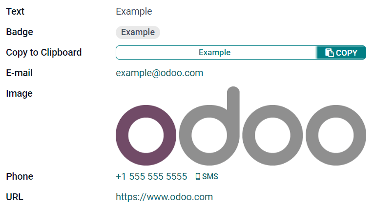
Text (char)
The Text field is used for short text containing any character. One text line is displayed when filling out the field.
Badge: displays the value inside a rounded shape, similar to a tag. The value cannot be edited on the UI, but a default value can be set.
Copy to Clipboard: users can copy the value by clicking a button.
E-mail: the value becomes a clickable mailto link.
Image: displays an image using a URL. The value cannot be edited manually, but a default value can be set.
Note
This works differently than selecting the Image field directly, as the image is not stored in Odoo when using a Text field with the Image widget. For example, it can be useful if you want to save disk space.
Phone: the value becomes a clickable tel link.
Tip
Tick Enable SMS to add an option to send an SMS directly from Odoo next to the field.
URL: the value becomes a clickable URL.
Example
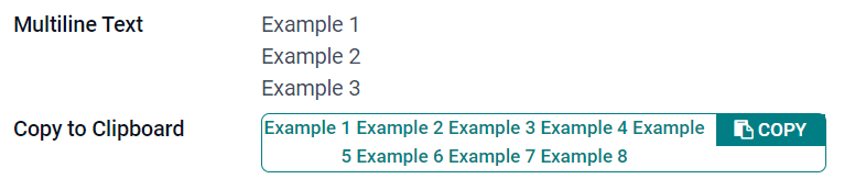
Multiline Text (text)
The Multiline Text field is used for longer text containing any type of character. Two text lines are displayed on the UI when filling out the field.
Copy to Clipboard: users can copy the value by clicking a button.
Example
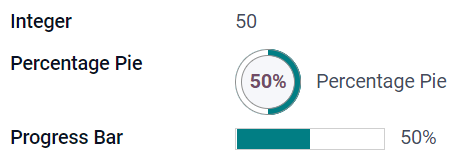
Integer (integer)
The Integer field is used for all integer numbers (positive, negative, or zero, without a decimal).
Percentage Pie: displays the value inside a percentage circle, usually for a computed value. The value cannot be edited on the UI, but a default value can be set.
Progress Bar: displays the value next to a percentage bar, usually for a computed value. The field cannot be edited manually, but a default value can be set.
Handle: displays a drag handle icon to order records manually in List view.
Example
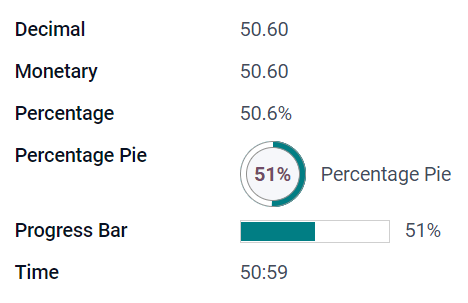
Decimal (float)
The Decimal field is used for all decimal numbers (positive, negative, or zero, with a decimal).
Note
Decimal numbers are displayed with two decimals after the decimal point on the UI, but they are stored in the database with more precision.
Monetary: it is similar to using the Monetary field. It is recommended to use the later as it offers more functionalities.
Percentage: displays a percent character
%after the value.Percentage Pie: displays the value inside a percentage circle, usually for a computed value. The field cannot be edited manually, but a default value can be set.
Progress Bar: displays the value next to a percentage bar, usually for a computed value. The field cannot be edited manually, but a default value can be set.
Time: the value must follow the hh:mm format, with a maximum of 59 minutes.
Example
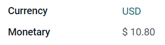
Monetary (monetary)
The Monetary field is used for all monetary values.
Note
When you first add a Monetary field, you are prompted to add a Currency field if none exists already on the model. Odoo offers to add the Currency field for you. Once it is added, add the Monetary field again.
Example
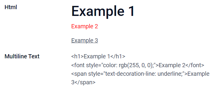
Html (html)
The Html field is used to add text that can be edited using the Odoo HTML editor.
Multiline Text: disables the Odoo HTML editor to allow editing raw HTML.
Example
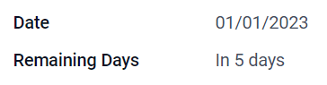
Date (date)
The Date field is used to select a date on a calendar.
Remaining Days: the remaining number of days before the selected date is displayed (e.g., In 5 days), based on the current date.
Example
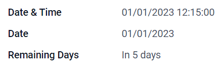
Date & Time (datetime)
The Date & Time field is used to select a date on a calendar and a time on a clock. The user’s current time is automatically used if no time is set.
Date: used to record the time without displaying it on the UI.
Remaining days: displays the remaining number of days before the selected date (e.g., In 5 days), based on the current date and time.
Example
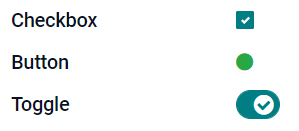
Checkbox (boolean)
The Checkbox field is used when a value should only be true or false, indicated by checking or unchecking a checkbox.
Button: displays a radio button. The widget works without switching to the edit mode.
Toggle: displays a toggle button. The widget works without switching to the edit mode.
Example
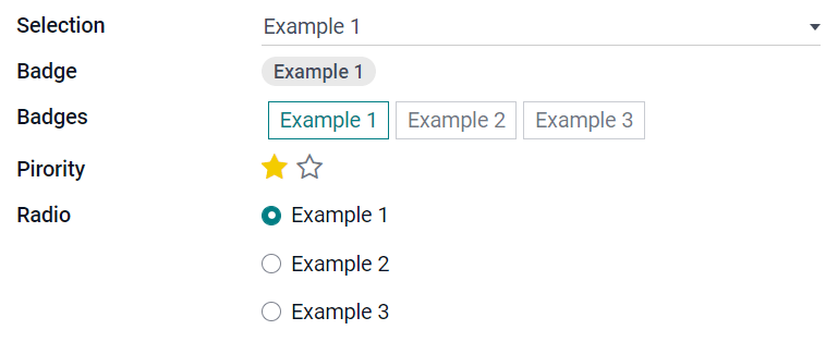
Selection (selection)
The Selection field is used when users should select a single value from a group of predefined values.
Badge: displays the value inside a rounded shape, similar to a tag. The value cannot be edited on the UI, but a default value can be set.
Badges: displays all selectable values simultaneously inside rectangular shapes, organized horizontally.
Priority: displays star symbols instead of values, which can be used to indicate an importance or satisfaction level, for example. This has the same effect as selecting the Priority field, although, for the latter, four priority values are already predefined.
Radio: displays all selectable values at the same time as radio buttons.
Tip
By default, radio buttons are organized vertically. Tick display horizontally to switch the way they are displayed.
Example
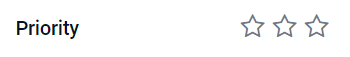
Priority (selection)
The Priority field is used to display a three-star rating system, which can be used to indicate importance or satisfaction level. This field type is a Selection field with the Priority widget selected by default and four priority values predefined. Consequently, the Badge, Badges, Radio, and Selection widgets have the same effects as described under Selection.
Tip
To change the number of available stars by adding or removing values, click Edit Values. Note that the first value is equal to 0 stars (i.e., when no selection is made), so having four values results in a three-star rating system, for example.
Example
File (binary)
The File field is used to upload any type of file, or sign a form (Sign widget).
Image: users can upload an image file, which is then displayed in Form view. This has the same effect as using the Image field.
PDF Viewer: users can upload a PDF file, which can be then browsed from the Form view.
Sign: users can electronically sign the form. This has the same effect as selecting the Sign field.
Example
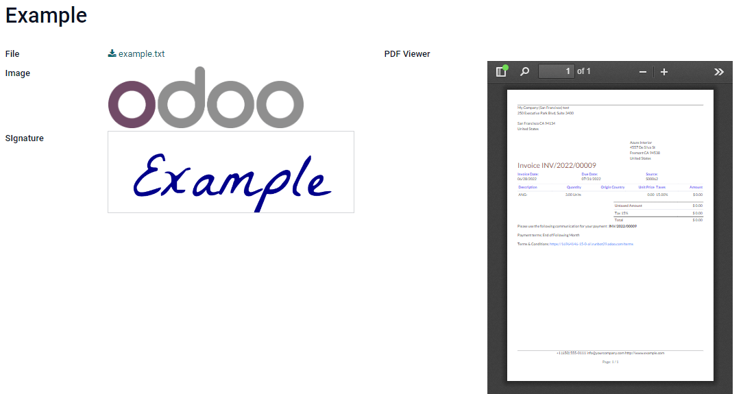
Image (binary)
The Image field is used to upload an image and display it in Form view. This field type is a File field with the Image widget selected by default. Consequently, the File, PDF Viewer, and Sign widgets have the same effects as described under File.
Tip
To change the display size of uploaded images, select Small, Medium, or Large under the Size option.
Sign (binary)
The Sign field is used to sign the form electronically. This field type is a File field with the Sign widget selected by default. Consequently, the File, Image, and PDF Viewer widgets have the same effects as described under File.
Tip
To give users the Auto option when having to draw their signature, select one of the available Auto-complete with fields (Text, Many2One, and Related Field on the model only). The signature is automatically generated using the data from the selected field.
Relational fields
Relational fields are used to link and display the data from records on another model.
Note
Non-default widgets, when available, are presented as bullet points below.
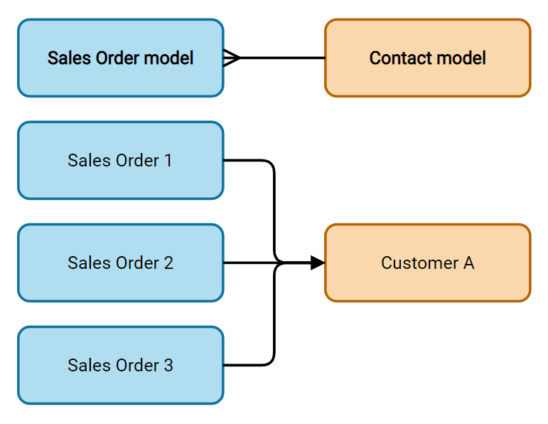
Many2One (many2one)
The Many2One field is used to link another record (from another model) to the record being edited. The record’s name from the other model is then displayed on the record being edited.
Example
On the Sales Order model, the Customer field is a Many2One field pointing at the Contact model. This allows many sales orders to be linked to one contact (customer).
Tip
To prevent users from creating a new record in the linked model, tick Disable creation.
To prevent users from opening records in a pop-up window, tick Disable opening.
To help users only select the right record, click on Domain to create a filter.
Badge: displays the value inside a rounded shape, similar to a tag. The value cannot be edited on the UI.
Radio: displays all selectable values at the same time as radio buttons.
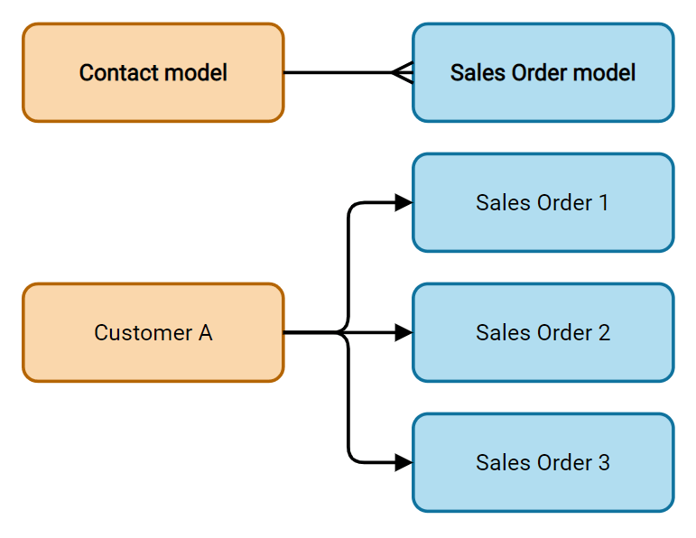
One2Many (one2many)
The One2Many field is used to display the existing relations between a record on the current model and multiple records from another model.
Example
You could add a One2Many field on the Contact model to look at one customer’s many sales orders.
Note
To use a One2Many field, the two models must have been linked already using a Many2One field. One2Many relations do not exist independently: a reverse-search of existing Many2One relations is performed.
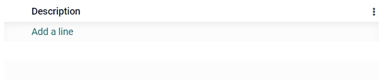
Lines (one2many)
The Lines field is used to create a table with rows and columns (e.g., the lines of products on a sales order).
Tip
To modify the columns, click on the Lines field and then Edit List View. To edit the form that pops up when a user clicks on Add a line, click on Edit Form View instead.
Example
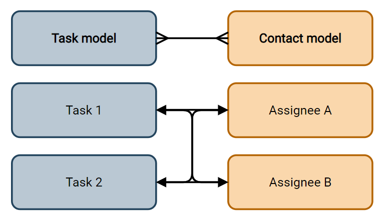
Many2Many (many2many)
The Many2Many field is used to link multiple records from another model to multiple records on the current model. Many2Many fields can use Disable creation, Disable opening, Domain, just like Many2One fields.
Example
On the Task model, the Assignees field is a Many2Many field pointing at the Contact model. This allows a single user to be assigned to many tasks and many users to be assigned to a single task.
Checkboxes: users can select several values using checkboxes.
Tags: users can select several values appearing in rounded shapes, also known as tags. This has the same effect as selecting the Tags field.
Tags (many2many)
The Tags field is used to display several values from another model appearing in rounded shapes, also known as tags. This field type is a Many2Many field with the Tags widget selected by default. Consequently, the Checkboxes and Many2Many widgets have the same effects as described under Many2Many.
Tip
To display tags with different background colors, tick Use colors.
Example

Properties
Invisible: When it is not necessary for users to view a field on the UI, tick Invisible. It helps clear the UI by only showing the essential fields depending on a specific situation.
Example
On the Form view of the Contact model, the Title field only appears when Individual is selected, as that field would not be helpful for a Company contact.
Note
The Invisible attribute also applies to Studio. To view hidden fields inside Studio, click on a view’s View tab and tick Show Invisible Elements.
Required: If a field should always be completed by the user before being able to proceed, tick Required.
Read only: If users should not be able to modify a field, tick Read only.
Note
You can choose to apply these three properties only for specific records by clicking on Conditional and creating a filter.
Label: The Label is the field’s name on the UI.
Note
This is not the same name as used in the PostgreSQL database. To view and change the latter, activate the Developer mode, and edit the Technical Name.
Help Tooltip: To explain the purpose of a field, write a description under Help Tooltip. It is displayed inside a tooltip box when hovering with your mouse over the field’s label.
Placeholder: To provide an example of how a field should be completed, write it under Placeholder. It is displayed in light gray in lieu of the field’s value.
Widget: To change the default appearance or functionality of a field, select one of the available widgets.
Default value: To add a default value to a field when a record is created, use Default value.
Limit visibility to groups: To limit which users can see the field, select a user access group.